|
Dash of Inspiration Post for GCU Community Blog Let’s continue with a visual review and discussion of the areas listed in GCU’s Submission Guidelines. Today we’ll keep this series going with the second area in the COMPOSITION grouping of the Submission Guidelines which is: COMPOSITION: Balance of Elements The Submission Guidelines state this: A feeling of visual equality. Objects, values, colors, textures, shapes, forms, etc., are used in creating balance in a composition. Balance is a visual interpretation of gravity in the design. Large, dense elements appear to be heavier while smaller elements appear to be lighter. In art ... Read Entire Article 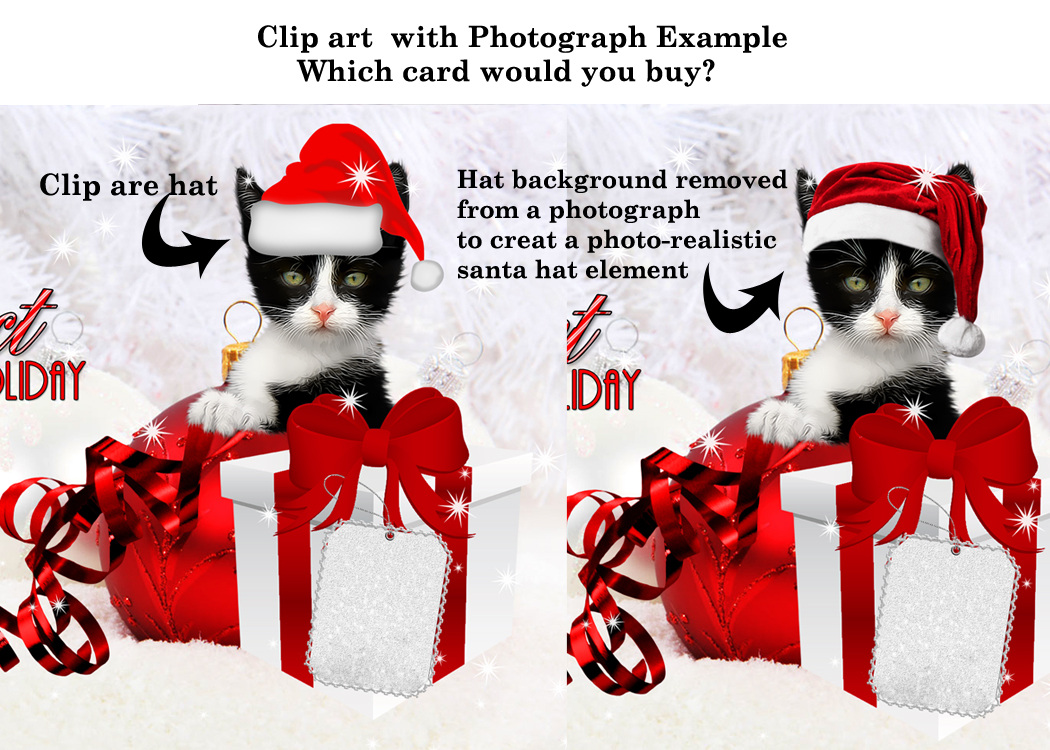
0 Comments
Dash of Inspiration Post for GCU Community Blog I thought it might be helpful to have a series that addresses each (or many) of the areas listed in the Submission Guidelines. I’ll to offer some visuals and perhaps more details that might be beneficial to offer a better understanding of these categories. Today we’ll start this series off with the first main grouping of the Submission Guidelines which is: COMPOSITION: Subject Matter ... Read Full Article & See More Examples 
Photo courtesy of Petr Kratochvil Example of Poor Angle
Dash of Inspiration Post for GCU Community Blog Many of us like to work with old vintage images and they’re a great source for greeting card designs, but leaving a vintage photo or image as is and using it with all it’s faults does not usually make for a good greeting card. Cleaning up and improving spots, poor contrast, scratches and in general poor image quality does not mean you are losing the ‘vintage’ feel of the image and ... Read Entire Article 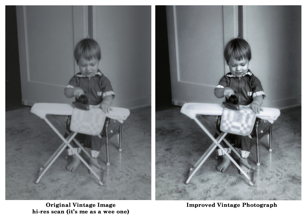  ©Doreen Erhardt Dash of Inspiration
Post for GCU Community Blog To be successful, this is such a critical element in greeting card design. Though there certainly is some percentage of people who lean more toward blank cards so they can add their own heartfelt message, it is a minute percent of the average greeting card buyer ... Read Full Article  ©Doreen Erhardt Dash of Inspiration
Post for GCU Community Blog When you put your copyright on your image front, here are some things to consider: Never spell out copyright, not only is this unnecessary, it’s adding a lot of text to the front of your card that stands out and is rather unappealing to the consumer … I mention this because there are some of you who do this, in rather large text. For those who don’t know how to make the © symbol, here’s how ... Read Full Article 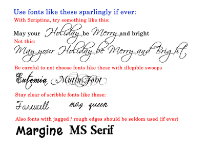 Dash of Inspiration
Post for GCU Community Blog Welcome to the Season Finale of ‘Diaries of a Fontaholic’. In today’s segment I’ll share some font tips that can make the difference between a professional greeting card, and a greeting card which looks amateurish … based solely on your choice of font and placement. We’ve chatted before about placement, kerning, etc., so be sure to check out ... Read Full Article & Get Links! 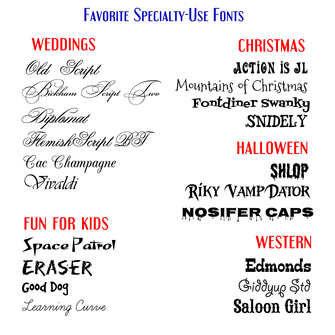 Dash of Inspiration
Post for GCU Community Blog Welcome to the third installment of ‘Diaries of a Fontaholic’. I decided that it was better to split today’s segment into two weeks, so next week will be the final installment where I’ll share some font tips that can make the difference between a professional greeting card, and a greeting card which looks amateurish … based solely on your choice of font and placement. Today, in Part-3, I’ll be introducing you to ... Read Full Article & Get FONTS 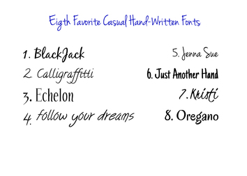 Dash of Inspiration
Post for GCU Community Blog Welcome to ‘Diaries of a Fontaholic Part 2′. Today I’ll be introducing you to my 8 Favorite ‘hand-written’ casual fonts. These are a great choice for when your design and category call for a more ‘intimate’ connection; also often a better choice for masculine cards, rather than choosing a fancy script font which can be considered by some to be a bit feminine. Also, my Nine Favorite replacements for Comic-Sans. All terrific choices for your humorous designs. Here we go … Read Full Article & GET FONTS!  ©Doreen Erhardt Dash of Inspiration Post for GCU Community Blog Here’s a great tip: Even if you’re designs have the year as Custom Text, if you used a year that has gone by, take the time to update those cards. Any card that is out of date will be ignored by a large percentage of customers. I tend to ... Read Full Article and Get Links 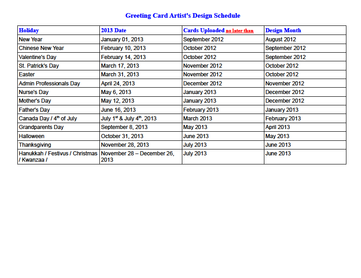 Dash of Inspiration
Post for GCU Community Blog If you’ve ever submitted to greeting card publishing houses, you know they only accept holiday specific designs certain times of year – usually anywhere from six-months to nine-months in advance of the occasion. As a professional greeting card designer ... Read Full Article & Get Links |
Resources
Here we archive our Photo Tips, Tutorials, Marketing Tips and Preset Downloads from all our sites. ENJOY! Categories
All
My favorite
|


|
|

Commercial License Holder
|

Salon of Art
on Red bubble